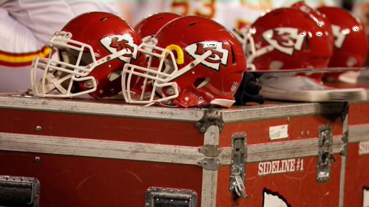
The official logo for the Kansas City Chiefs was ranked among the worst in the NFL in a recent poll of football fans.
At this point, we’re all used to the logo. The intersection of a K and a C at the heart of an arrowhead is placed not only on the helmets of the players we love to watch every season but also on our own sportswear and memorabilia we’ve collected at home. As Chiefs fans, the logo is part of the overall package, which means we likely don’t think much about it.
However, MDRG did recently think about this logo as well as the rest of the branding found in the National Football League. In a recent poll conducted with over 1,400 participants, the market research firm posted the results over at FanJuicer with the reviews not looking so hot for Kansas City.
More from Arrowhead Addict
- Former Chiefs cornerback in legal trouble in Las Vegas
- Chiefs Kingdom: Get ready to break contract news
- Chiefs news: Travis Kelce wants to host fan ‘chug-off’ in Germany
- Podcast: Breaking down the Chiefs biggest roster battles
- KC Chiefs send Dave Merritt to NFL coaching accelerator
Among the 32 teams in the NFL, the Kansas City Chiefs were ranked at No. 22 overall in terms of overall logo rankings. You should visit the page to find out more about their methodology, but it’s a great sample size which makes it clear that most football fans in general would put the Chiefs in line for a graphic overhaul.
Alongside the complete results, MDRG included comments by a graphic designer they worked with to gain some creative insight into each logo. Here was the response for the Chiefs:
"I get what they are going for with the shape around the arrowhead. I’ve seen an arrowhead in real life, and I understand this is how they look, but it doesn’t mean it is going to look good in a logo. These squiggly lines contrast really oddly with these good clean lines in the cipher. It is kind of jarring and it doesn’t go well together."
The designer’s response was basically summed up with “meh,” which resonates with their No. 22 ranking overall. Most fans would likely say, “Well, it’s not the worst thing I’ve ever seen.” That’s not great, but it’s also not the Cleveland Browns or New York Jets, who were ranked as worst and second-worst respectively. As for the best? The New Orleans Saints, Detroit Lions and Atlanta Falcons all finished within a few votes of each other for top honors.
What do you think of the Chiefs logo? Would you be up for some changes, even subtle ones? Would you alter the “squiggly lines” at least? Leave it as is? Sound off in the comments below.
