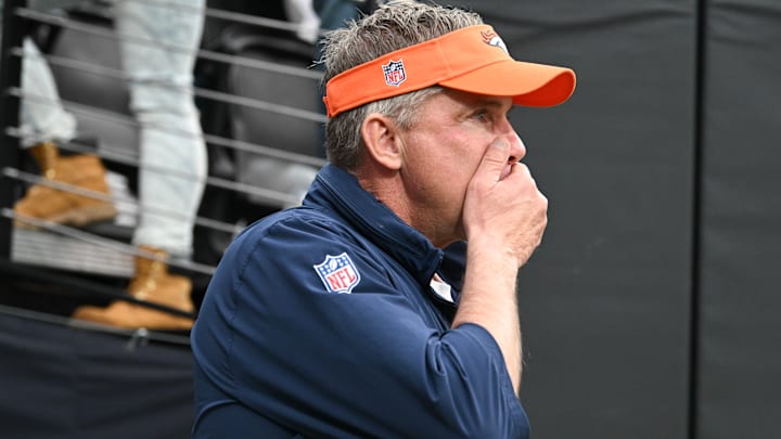
For most NFL fans, the primary concern this time of the year—and always, really—is the quality of the product that your team puts on the field, especially around NFL Draft time, which is three days away. Fans want more insight into what the team is doing to improve on wherever they may have lacked in the previous season.
For the Denver Broncos, that involves a lot of areas. Unfortunately for fans of the Donkeys, on Monday, they received no insight into their draft crushes, nor did they hear anything about their plans to end a streak of seven consecutive losing seasons.
Instead, they got a car commercial that unveiled new uniforms for the team.
A new era forged by #BroncosCountry. pic.twitter.com/LaK3ZfsoZ9
— Denver Broncos (@Broncos) April 22, 2024
Look, I get it, Broncos ownership has to do something to stir up some kind of excitement around a franchise that has been at or near the basement in the AFC West since Peyton Manning hung up his spurs. New uniforms are a good way to stir excitement in a fan base—at the very least, it's a good way to sell more merchandise. And to be completely honest, when the ceiling is any uniform combination the Broncos have ever trotted out (to Chiefs fans, all grotesque), you have nowhere to go but up in introducing new threads to the masses.
The announcement itself was electric, without question, but it certainly had me wondering how many JD Power and Associates awards the Ford Bronco won as opposed to stirring any type of excitement at all about an elementary art project-esque football uniform overhaul. These threads certainly aren't built Ford Tough.
My first thought, a shared opinion with many on Twitter, was that these are very. collegiate. Which is great. When you need this level of roster turnover, it is always helpful to have something attractive to unveil to recruits looking to choose a place to play. Maybe they could even find themselves a five-star signal caller. Wait... I'm being told this is a professional football team and uniforms will have no impact on their roster building or ability to become an attractive destination for talented players.
Ok, the producer is buzzing into my headset again and it appears I'm off base. Let me regroup.
There's nothing that will dull the sting of trading not only actual football players but also draft picks who ended up becoming franchise tackles, corners, and various other role players for the Seahawks like the introduction of some new uniforms that are slightly different than your old ones! I mean, look at the enhancements the Broncos rolled out here. With a creative department led by a guy who is aware of Denver's general elevation and the purple Teletubby, Denver's marketing and design folks look like they're all jockeying for raises.
And kudos to Nike. There's never been a time to have your hands all over a lackluster football jersey reimagination campaign like now. With Fanatics footing most of the blame for MLB's atrocious jerseys this year, the bar was set exceptionally low and Nike and the Broncos did a fantastic job of (just barely) clearing it. Although it is funny that the merchandising giant has their hands on both of these modern masterpieces.
I mean just look at the nuanced touches the Broncos have added in this uniform redesign. There are several triangles on the duds because mountains are Earth's triangles. I'm not sure if you're familiar with Colorado or not, but there are actual mountains there, hence the triangles. Also, for those who have not become familiar with the Broncos home field advantage, Denver is approximately a mile above sea level elevation-wise. Hence, "Mile High" Stadium, which is paid tribute to by the "5280," can be found in a couple of different places on these new duds. That's how far a mile is in feet. Pretty neat, yeah?
The Broncos' jersey colors stayed the same as before. They just decided that random flare marks on the side of their jerseys should be replaced with triangles because their geography is mountainous. I have to applaud the creativity and nuance that went into this. Hopefully, the Broncos front office and coaching staff mimic this level of creativity in dreaming up how they want to attempt to put a competitive product on the field for actual NFL games.
